This is a page dedicated to different design trends. It’s important to stay up to date with trends so you can keep your brand relevant. Take a look at designers like Philip VanDusen and The Futur to keep up to date on these trends. Plus there’s always good old fashioned research, but ain’t nobody got time for that!
15 Design Trends for 2018 by Philip VanDusen
All of these design trends come from Philip VanDusen. I don’t claim to have found this information out on my own, I only wish to share it and give my thoughts on them. You can watch his video here or on You Tube:
In this video he talks about 15 design trends to be aware of in 2018.
ONE – Disjointed Text:
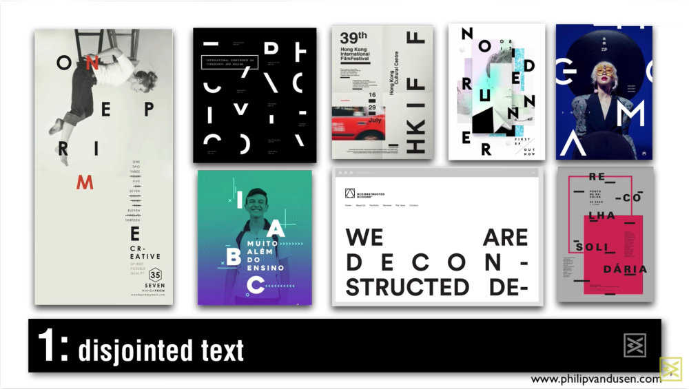
(Image from 15 Trends in Graphic Design for 2018 video)
Disjointed text still delivers a message, but not as directly as having the word as a whole. The goal of design is to reach your audience! Most advertisements pose a question like “Have you ever” or “What would you do if” so that people think about the advertisement. Disjointed text is one of those ways to keep the viewer or consumer engaged in the design without posing a question directly. Whatever you can do to keep people looking at your design is going to drive the intended message further into their minds. As a graphic designer, you really want your audience engaged in the design. You want them to think about it later. You want them to talk about it with their friends. Little tricks like this one will keep them looking at it longer in order to understand the message. You really have to be careful not to cause confusion, so try to keep at least two letters in proximity or even on the same line, so the viewer has an idea what they’re reading. Hierarchy is still very important in design and using it is the best way to guide the viewers eyes in the direction you want them to look.
TWO – Brightness:

(Image from 15 Trends in Graphic Design for 2018 video)
The “Brightness” trend seems to stem from the surge of 80’s and 90’s retro styles. I loved the 80’s and the 90’s and now the trend seems to be everywhere. This style of design is a mix of retro and surrealism. Imagine if Dali had a computer to work with when he produced art and mixed this bright style into his work.
THREE – Glitch:
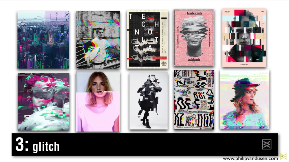
(Image from 15 Trends in Graphic Design for 2018 video)
Glitch style looks like it comes from seeing imperfections in digital media. Glitches happen in older machines or corrupted software. Designers are now using those imperfections to make art. Instead of looking at a glitch as a mistake it is now embraced and used as part of the narrative or message.
FOUR – Color Channel:

(Image from 15 Trends in Graphic Design for 2018 video)
Color Channel sort of piggy backs on the Glitch style. instead of embracing mistakes in the digital realm, these are mistakes one would see in print. The four color spectrum used in print is CMYK and instead of having that mix of colors make new colors, in the Color Channel design style it is being separated and overlaid to make new designs.
FIVE – Sliced Text:
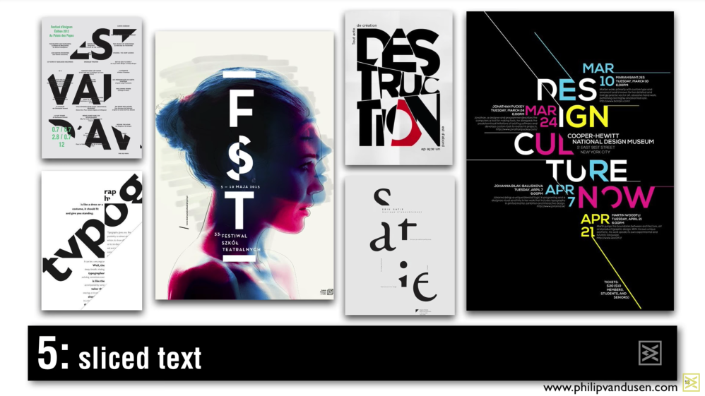
(Image from 15 Trends in Graphic Design for 2018 video)
The “Sliced Text” style seems to go inline with the “Glitch” and “Color Channel” design styles. Whereas the previous two are about embracing mistakes, this style is more like a collage. The text is there, but instead of separating the individual letters and laying them out like “Disjointed Text” here the letters themselves are being cut up and laid out to keep the viewer engaged.
SIX – Integration:

(Image from 15 Trends in Graphic Design for 2018 video)
Integration works so well to make the text and images become one cohesive piece. Instead of having visual hierarchy to lead the viewer through the message this style mashes the text and image together to let the viewer decide how they want to read it. You can begin to read the word, but then it is interrupted by a part of the image, but the letters don’t stop, so the brain can’t stop reading what it sees. It’s another good example of a different method for keeping the viewer engaged.
SEVEN – Liquid:

(Image from 15 Trends in Graphic Design for 2018 video)
Liquid design is probably my favorite among these trends. This effect, when applied properly, can bring the design to life. Either 2D or 3D liquid design makes the viewer stop and pay attention to the design. The goal is always to have the audience looking at the design longer than the split second thought that may come from a regular design. Since water is such an important element for life, the liquid design breathes life into the overall graphic.
EIGHT – Illustration:
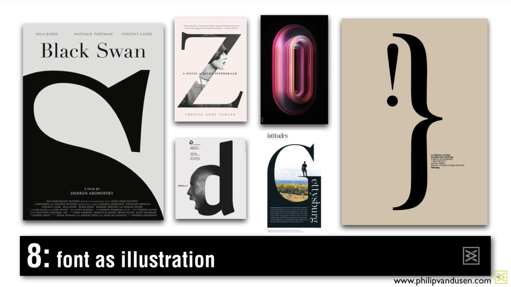
(Image from 15 Trends in Graphic Design for 2018 video)
Font as Illustration is as straightforward as it can be, but using a letter or a word to make up the illustration can really drive home the overall message. The Black Swan example is perfect because it uses the “S” from “Swan” to give the viewer an image of a swan. Whether it really looks like it or not the title and the “S” are playing off of each other. This is another way of keeping your audience engaged.
NINE – Iconification:

(Image from 15 Trends in Graphic Design for 2018 video)
Iconification reminds me of Andy Warhol’s style because the designer is attempting to create an icon within the design itself and Warhol used major icons to create his designs. Rather than using a pre-existing icon these are creating the icons for the design. An icon can be simple or complex, but icons, when used properly, can easily drive a message to the audience without using a single word.
TEN – Playbill:

(Image from 15 Trends in Graphic Design for 2018 video)
This “Playbill” style has been around for years, coming and going since it was first used back when Houdini was still alive. This style has been used mainly for broadway and concerts. The layout is the style itself, splitting the text up in different fonts and different styles to break up the message so that the viewer takes their time reading it. Although these are mostly text heavy, some images are used like in the MUSE poster to further dissect the design and layout.
The eleventh one is Text as Design:

(Image from 15 Trends in Graphic Design for 2018 video)
This style seems to stem from the Playbill and Font as Illustration. Using text as the design or as the illustration can be tricky and a lot of conceptualization should go into the design process, but when executed correctly it can really drive a simple message. Text as design can be seen in a lot of clothing design, especially if the brand is trying to associate itself with a word or phrase.
The twelfth one is Systematic Color:
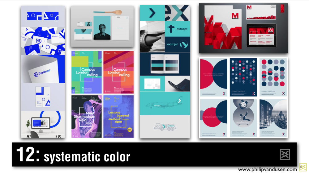
(Image from 15 Trends in Graphic Design for 2018 video)
This one sounds complicated, but it’s really just applying a graphical standard over multiple designs. It can’t be stressed enough that when designing for a company, large or small, a standard should be created and applied for consistency; it is the key to making sure the audience remembers the brand. Think about how Coke uses red or Nike uses orange. Systematic Color is a part of that design standard process. Choosing colors that play well with each other creates an atmosphere within the design. As a designer, one can create a desired mood by carefully choosing a color scheme that helps drive the message.
The thirteenth one is Systematic Color:

(Image from 15 Trends in Graphic Design for 2018 video)
This design style takes order and then deconstructs it to create a sense of chaos. Even though some of these designs may look chaotic, when viewed long enough, the message still shines through. This style seems to take the disjointed text, sliced text, and integration styles and further explore using them together.
The fourteenth one is Photo Masking:

(Image from 15 Trends in Graphic Design for 2018 video)
Masking in any program can be confusing at first, but once mastered it can be used to create amazing design pieces like these. It’s almost a mix of Integration and text as illustration. A mix is created with an image and then using text as part of the image, like in some of these examples. In other designs it can be used to create a message just using images, like the one with the face making up the woman’s body, showing the audience a message without using words.
The final one is Transparency:

(Image from 15 Trends in Graphic Design for 2018 video)
Transparency used in designs can highlight a specific area of the design, creating a message using only visual stimuli. Other times it can be used to show the image and still have the type be visible. The images with Daniel Craig and Kevin Spacey use transparency to highlight the eyes, creating an instant visual hierarchy. Sending a message is always the goal with design wether it be delivered through images, type, or both.
